Milkywire

Role
UX/UI designer at Milkywire.
Tasks
UX/UI, Product design and management, Strategy, User research
Case study: New ways to find and donate
Context
The Milkywire app allows users to discover and donate directly to ‘impacters’- researchers, scientists and experts working on conservation efforts to save the planet. Up to this point, users would select individual impacters within the app to donate to individually. Milkywire wanted to increase conversion and donations from users on the app.
Process
📊Research➔ 🚨Problem➔ 🗺Exploration➔ ⚙️Solution
📊 Research
Insights
Early stage KPIs indicated users had barriers for conversion, and of those converted users, 67% of active donors had chosen just 1 impacter to receive their monthly donation. We also held weekly on-site user tests to gather feedback on the donation experience, with participants making a donation to an impacter at the end of the session.
These sessions helped us begin defining the barriers for conversion; users couldn't find what they wanted, donating 'one by one' increased cognitive load and friction, and many did not understand their monthly donation could be split easily between multiple impacters.
With launch fast approaching, we decided to prioritise a solution within the milestone.
Prioritisation
From these insights I prioritised 3 problems to solve user needs and business goals- decreasing churn and increasing conversion rates. With the 3rd problem solving another type of user’s needs- our impacters. We wanted to help them secure donations for conservation work that isn't as popular, but is equally important.

🚨 Problem definition
Problem 1:
Users were struggling to find impacters or work they wanted to donate to, with users often assuming Milkywire was a platform solely for donating to help wildlife.
Problem 2:
Users had difficulty choosing from the range of impacters ("More options leads to harder decisions"- Hicks Law) expressing that they didn't have the time or motivation to donate to impacters one by one.
Problem 3:
Some impacters on the app received significantly less support (page views and monthly donations) on the app than others.
🧩 Creating HMW questions from these problems:
How might we
- help users understand what they can donate to
- help users find what they care about
- reduce cognitive load for users
- make it easier for users to start donating
- help impacters with more complex and less ‘appealing’ causes to secure donations
..to create one problem statement
How might we..make it easy for users to find work they care about and start donating?



🗺 Exploration
"How might we..make it easy for users to find work they care about and start donating?"
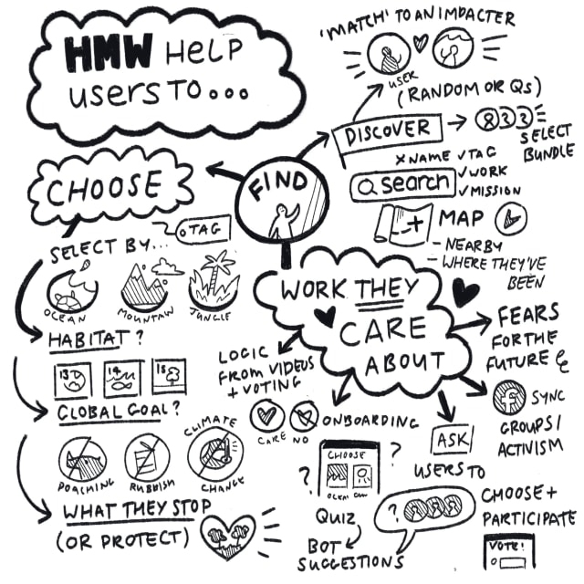
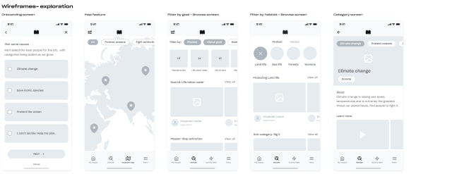
A key pain point for users was not being able to "find work they care about" - for users to find work we first needed to explore how we could better organize and sort what they do ourselves.
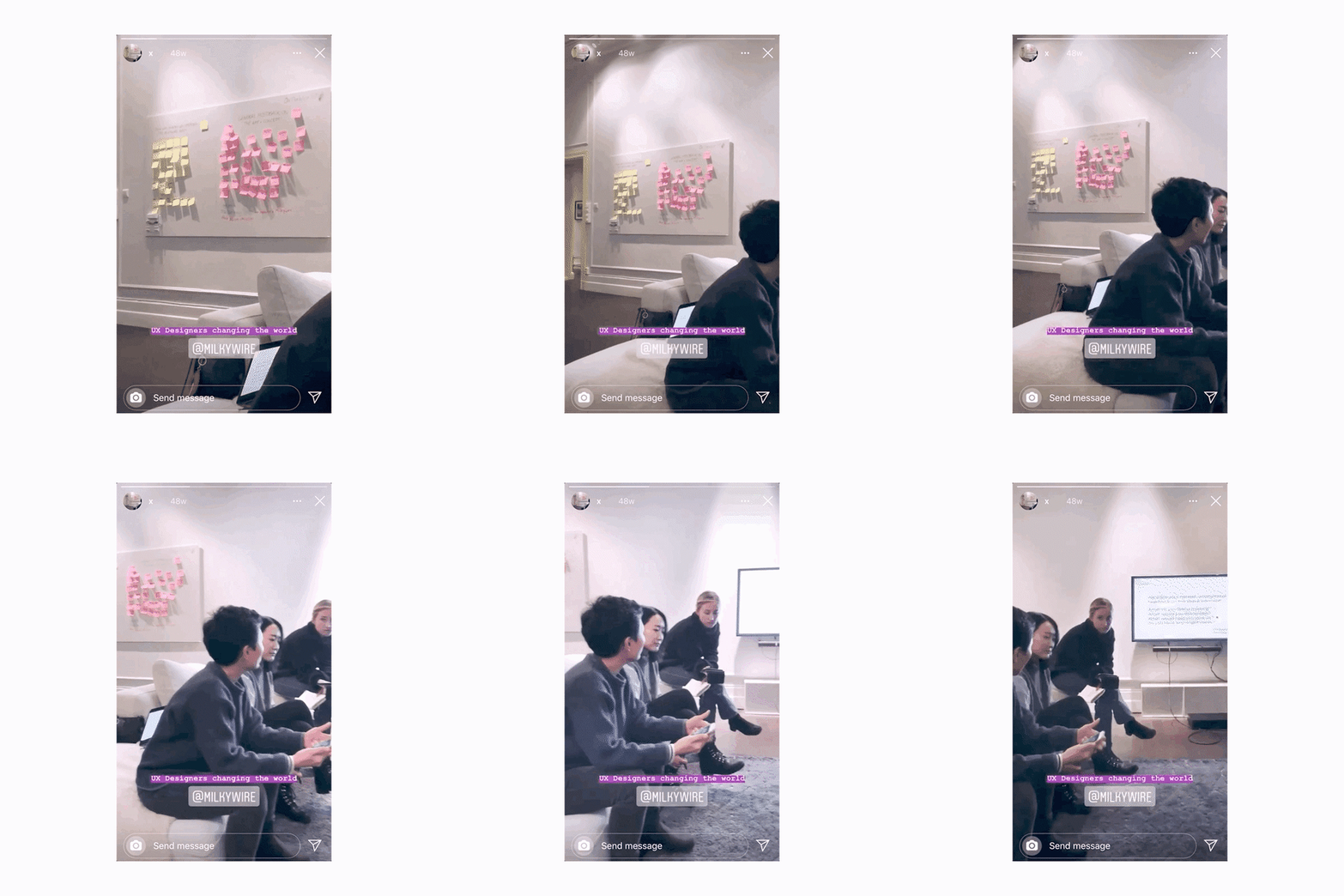
Stakeholders from the impact and content team had a workshop around how we categorise and sort our impacters internally to inform our external process. Impacters are selected by the Impact team based on the 4 biosphere SDGs (6: Clean water and sanitation, 13: Climate action, 14: Life under water, 15: Life on Land). In addition we brainstormed categorising based on SDG goals, habitat and using map location.
I chose 2 touch points in the user journey to refine the scope of my exploration, based on the KPIs we wanted to improve:
1. Onboarding
2. The 'Browse' page, for both the first time and existing users
🧪 Testing
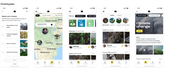
I tested different methods of categorisation, filtering and sorting impacters and their work on users with high-fidelity mock-ups. Many were unfamiliar with the sustainable goals and didn’t feel engaged by sorting by habitat, but users responded well to categorisation with actions and broader ‘missions’: i.e Fight extinction.
While I tested onboarding approaches, time restraints and prioritising a solution for both new and existing users meant this avenue was scoped out.


⚙️ Solution
⚙️ Impacter categories and their pages
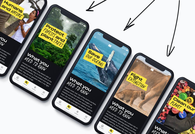
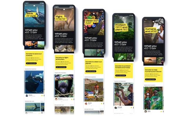
Based on feedback from our testing, we then created categories based on larger actionable ‘goals’ or missions that the impacters could be tied to, landing on 5 categories:
Save our oceans, Clean our planet, Protect forests and plant trees, Fight extinction and Humans & nature
Structure:
From this we also defined the information we wanted to include for users on each category page:
- an explanation of what each category is
- why users should care/donate to this category
- who to donate to
- social proof, an overview of how the category is supported by other Milkywire users


⚙️ New ways to donate
How might we..make it easy for users to find work they care about and start donating?
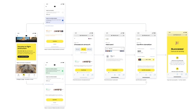
A solution was created for the way we enter the donation flow and bundle multiple impacters to donate to, this made it possible to donate to 'groups' of impacters at a time, meaning we could create new donation funnels:
1: Donate to a category
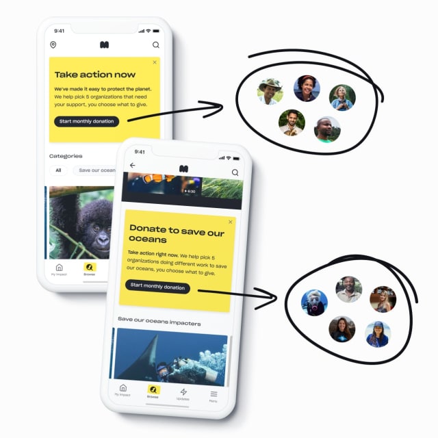
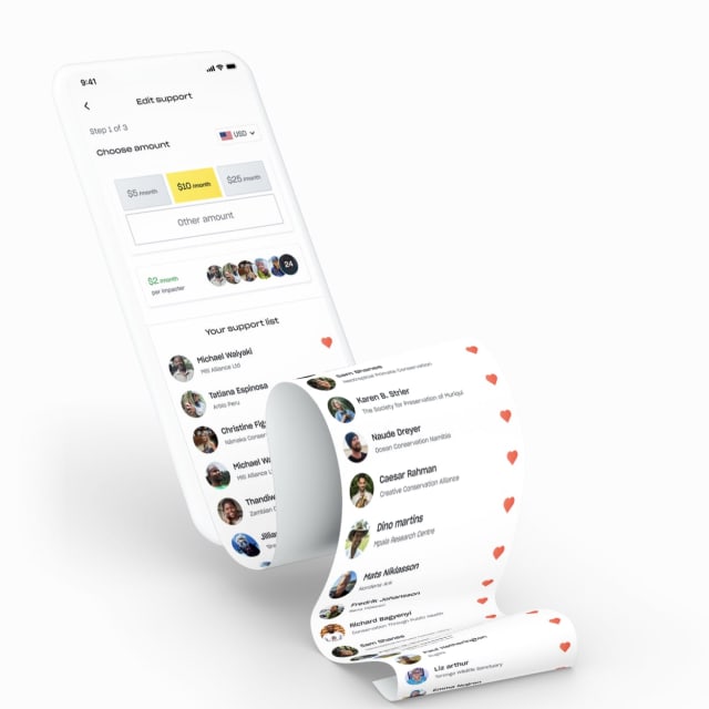
To make it easier for existing and new users to donate to more impacters- we created a donation model where users can donate to a category i.e. 'Save our oceans’. When the user donates, we create a selection of 5 impacters tagged in that category to donate to, giving users the ability to easily support a cause of their choice and help more impacters (including ones with less donations).
2: Donate to a mix of categories/impacters (Take action now)
We wanted a quick solution to help onboarding and unconverted users to decide where their donation goes without the friction. When users land on the 'browse' screen, they're asked if they would like us to select 5 impacters for them to donate to. We then create a selection of 5 impacters tagged from each category and they can begin donating to a range of conservation projects right away.



⭐️ Results
Analytics showed:
• 24% more donors supporting more than 1 impacter
• 59.67% of all donations are now made via the category and ’take action now’ donation funnel alone
♻️ Scoping & Iterating
♻️ Scoping
Category pages: Limitations in contentful tagging meant solutions to 'filter' shelves by category or automate tagging (i.e for impacters with less support) were scoped out. To test as an MVP, we used the structure and interaction patterns of the impacter profile pages in React.
Donating to a category/mix of impacters: Screens I tested to give the user limited controls and information on the 5 randomly selected impacters were initially scoped out. Feedback from prototyping indicated it would worsen the 'checkout' conversion rate, so I pushed for a compromise and the decision was made to gather drop-off data between screens and track performance.
♻️ Iterating
While conversion rates were up, rates of users converting from and visiting the category pages themselves was lower than expected, I conducted usability tests to determine if users could complete these goals:
- enter category pages from the browse tab
- learn about the category
- donate to a category of impacters
We noticed an issue with passive churn and drop-off, with user testing also confirming a slow load for content on category pages and response times for the category buttons on the browse screen. We changed the size and location of the category buttons, and tech worked on load times for the categories content and response time for the category menu.
Bonus: Adding a map feature
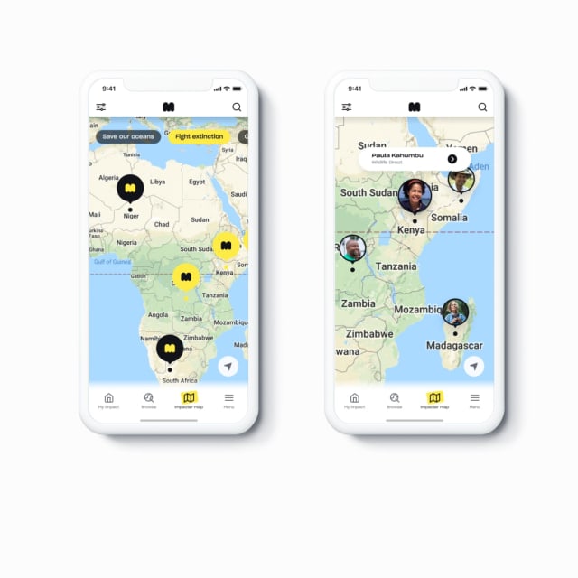
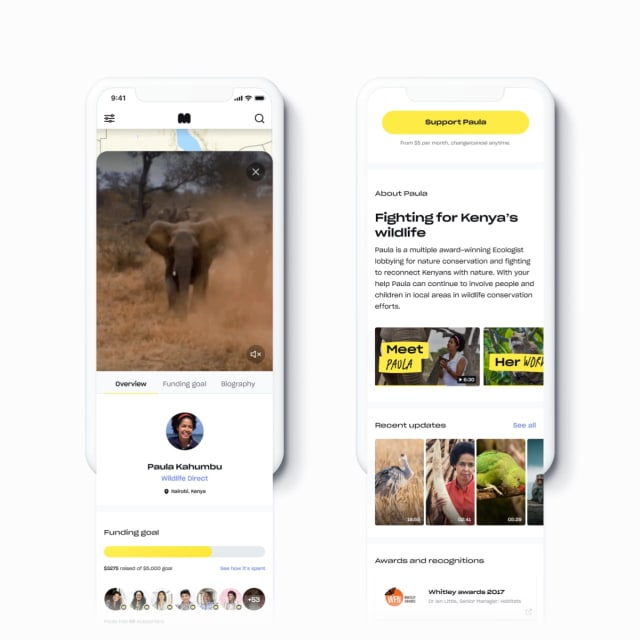
While we chose to focus our scope on the on-boarding and browse screens, a map feature continued to be feature that users focused on in feedback and responded to well in user testing.
During a hack day, I teamed up with a developer and iterated on prototypes of the map screen from the exploration and ideation phase of the case study. From this prototype we scoped the amount of work needed and allocated time to ship a functional map feature for release.


Workshop: Showing users their impact
Context:
Milkywire created internal USPs based on problems users face donating using a 'traditional' charity model, along with its external communication. During a milestone opening workshop we ideated around how we could better solve these specific problems in our product.
I was placed in a team and we had a brainstorming session around how we show users:
..their donations have impact (even smaller ones)
..they can track what happens with their donation
With so much bad news around climate change, often users we spoke to felt hopeless, or like their efforts didn't make a difference. We wanted a loveable way to drive engagement and help users understand the direct connection between their donation and the impact they make.


Outcome
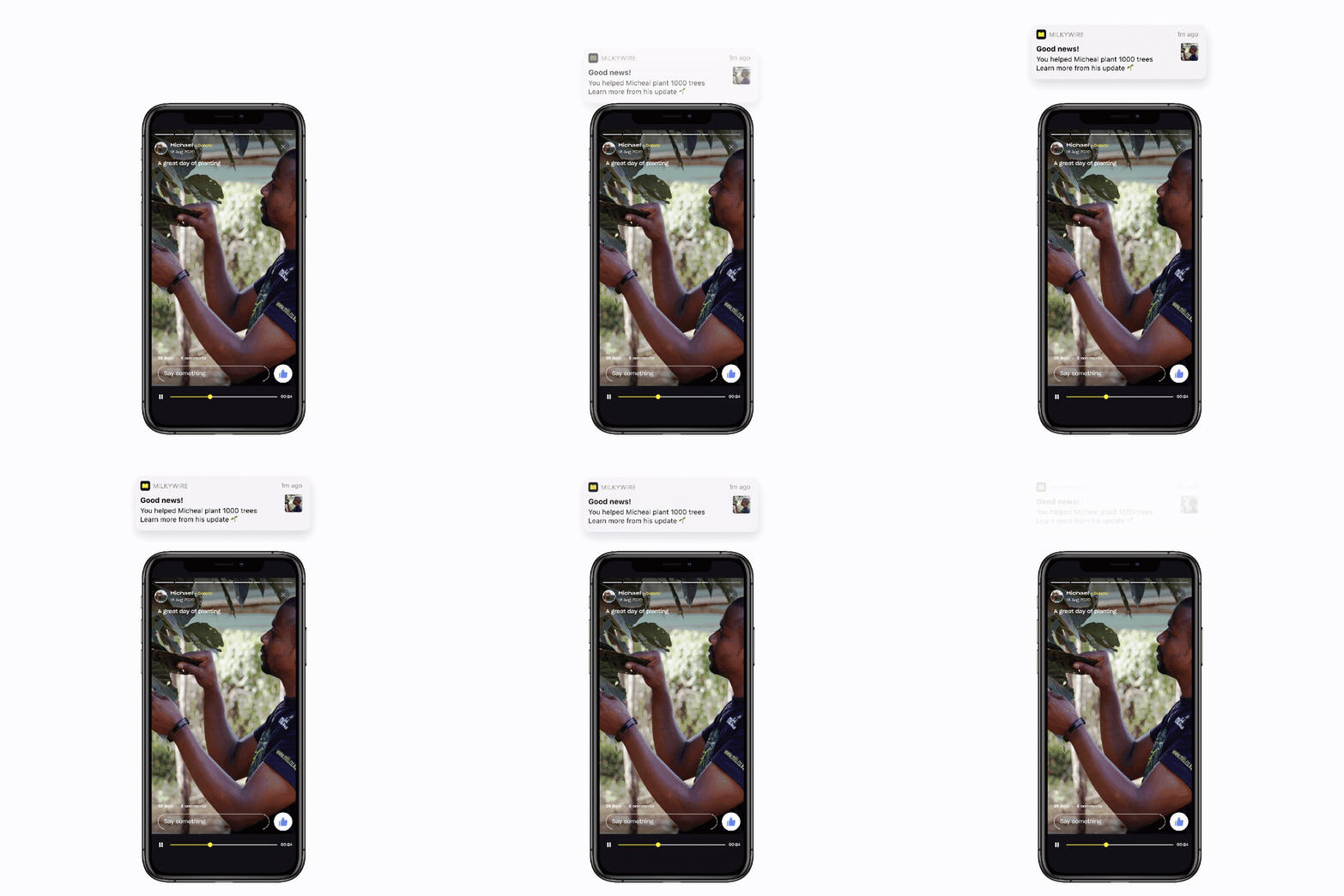
We created a way for each 'supporter' or donor to an impacter to receive push notifications when impacters they donate to achieved a major milestone or accomplishment. For the first scope we tested manually entered push notifications, engagement and app opens shot up. We then automised the push notifications to include the impacters projects, to tell users when their impacters achieved their project goal.


